ShopDreamUp AI ArtDreamUp
Deviation Actions


![Rainbow Dash and Soarin' - Lovey Dovey [Updated]](https://images-wixmp-ed30a86b8c4ca887773594c2.wixmp.com/f/0109013d-e47d-4b90-ad65-8cdaa70ff734/d53nizp-b5b79129-0f08-4774-ba47-138e4a09df11.png/v1/crop/w_184,h_184,x_50,y_0,scl_0.046046046046046/rainbow_dash_and_soarin____lovey_dovey__updated__by_bobthelurker_d53nizp-92s-2x.png?token=eyJ0eXAiOiJKV1QiLCJhbGciOiJIUzI1NiJ9.eyJzdWIiOiJ1cm46YXBwOjdlMGQxODg5ODIyNjQzNzNhNWYwZDQxNWVhMGQyNmUwIiwiaXNzIjoidXJuOmFwcDo3ZTBkMTg4OTgyMjY0MzczYTVmMGQ0MTVlYTBkMjZlMCIsIm9iaiI6W1t7ImhlaWdodCI6Ijw9NDMxIiwicGF0aCI6IlwvZlwvMDEwOTAxM2QtZTQ3ZC00YjkwLWFkNjUtOGNkYWE3MGZmNzM0XC9kNTNuaXpwLWI1Yjc5MTI5LTBmMDgtNDc3NC1iYTQ3LTEzOGU0YTA5ZGYxMS5wbmciLCJ3aWR0aCI6Ijw9OTAwIn1dXSwiYXVkIjpbInVybjpzZXJ2aWNlOmltYWdlLm9wZXJhdGlvbnMiXX0.KSCw0EZzgUSZufYQEzyVgLM6OIP3vMgmnLRHrT9OiMM)
![Rainbow Dash and Soarin' - Lovey Dovey [Updated]](https://images-wixmp-ed30a86b8c4ca887773594c2.wixmp.com/f/0109013d-e47d-4b90-ad65-8cdaa70ff734/d53nizp-b5b79129-0f08-4774-ba47-138e4a09df11.png/v1/crop/w_92,h_92,x_25,y_0,scl_0.023023023023023/rainbow_dash_and_soarin____lovey_dovey__updated__by_bobthelurker_d53nizp-92s.png?token=eyJ0eXAiOiJKV1QiLCJhbGciOiJIUzI1NiJ9.eyJzdWIiOiJ1cm46YXBwOjdlMGQxODg5ODIyNjQzNzNhNWYwZDQxNWVhMGQyNmUwIiwiaXNzIjoidXJuOmFwcDo3ZTBkMTg4OTgyMjY0MzczYTVmMGQ0MTVlYTBkMjZlMCIsIm9iaiI6W1t7ImhlaWdodCI6Ijw9NDMxIiwicGF0aCI6IlwvZlwvMDEwOTAxM2QtZTQ3ZC00YjkwLWFkNjUtOGNkYWE3MGZmNzM0XC9kNTNuaXpwLWI1Yjc5MTI5LTBmMDgtNDc3NC1iYTQ3LTEzOGU0YTA5ZGYxMS5wbmciLCJ3aWR0aCI6Ijw9OTAwIn1dXSwiYXVkIjpbInVybjpzZXJ2aWNlOmltYWdlLm9wZXJhdGlvbnMiXX0.KSCw0EZzgUSZufYQEzyVgLM6OIP3vMgmnLRHrT9OiMM)


Comments9
Join the community to add your comment. Already a deviant? Log In
Finally! I was looking forward to comment on it since you released it, but I always had not so much time.
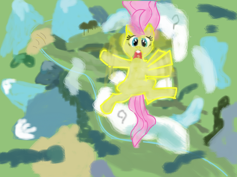
The first impression is pretty good (especially the thumbnail makes you click on this drawing). After seeing it just as it is, the quality decreases, but it's still a good drawing as for you, especially that your drawing are becoming better and better. There is only one thing that comes to my mind now and that I wanted to ask you from the very beginning even when I was writing a comment on your previous work - what is the technique you use to draw it? It's fine (of course) if you just want to stay on this "level" and you don't have to take my advices, but I see a problem with this technique. The problem is that you make a colouring first and then the outlines, making the drawing really messy. I'm not sure if you take screenshots from the show and put them into <insert_the_software_here> and colour (in case of a "yes" answer, I think you're doing it wrong as long as you don't create vectors - then try to take a screenshot, but just use it as a reference) or draw it from a reference screenshot (nothing wrong with it), but the outlines are generally created firstly and then you can even bucket the colours on it. The problem now is that the filling of the outlines is blurred and irregular (not saying it doesn't cover all the space and it sometimes crosses the outlines) what makes Fluttershy very messy. Moreover, the perfectly yellow colour of the outlines hurts my (and I guess not only my) eyes - it doesn't go well with the rest of the drawing.
There is a nice tutorial how to do a lineart by the way: [link]
The only thing I like in Fluttershy is her top mane - it surprisingly looks really good just as it is, with the irregularity and the colour of the outlines is fine.
As for the background, I have no objections - that's a well-made background! Very convincing, fills the space perfectly and I would even say it's like in the show.